7 March 2025
Neutral spaces are timeless, elegant, and safe—you really can’t go wrong with them. But let’s be honest: sometimes they feel a little… bland. You know, like toast without butter. If your beige walls and gray sofas are leaving you yawning, don’t worry! There’s a simple way to breathe life into your space without starting from scratch—introduce bold color choices. Yep, bold colors in a neutral space can work wonders. Let’s dive into how you can pull it off like a pro.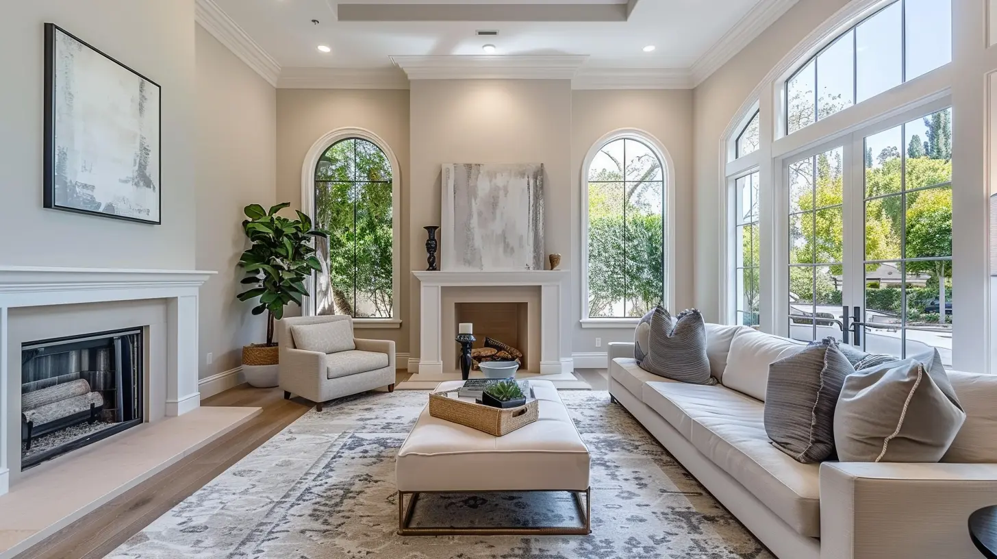
Why Bold Colors in Neutral Spaces Work
Before we get into the “how,” let’s talk about the “why.” Neutral spaces act as a blank canvas. This gives you the perfect opportunity to add splashes of color that grab attention without overwhelming the room. Think of it like accessorizing. A simple black dress can go from basic to stunning with the right necklace, earrings, or handbag. In the same way, bold colors can add personality, warmth, and depth to any neutral space.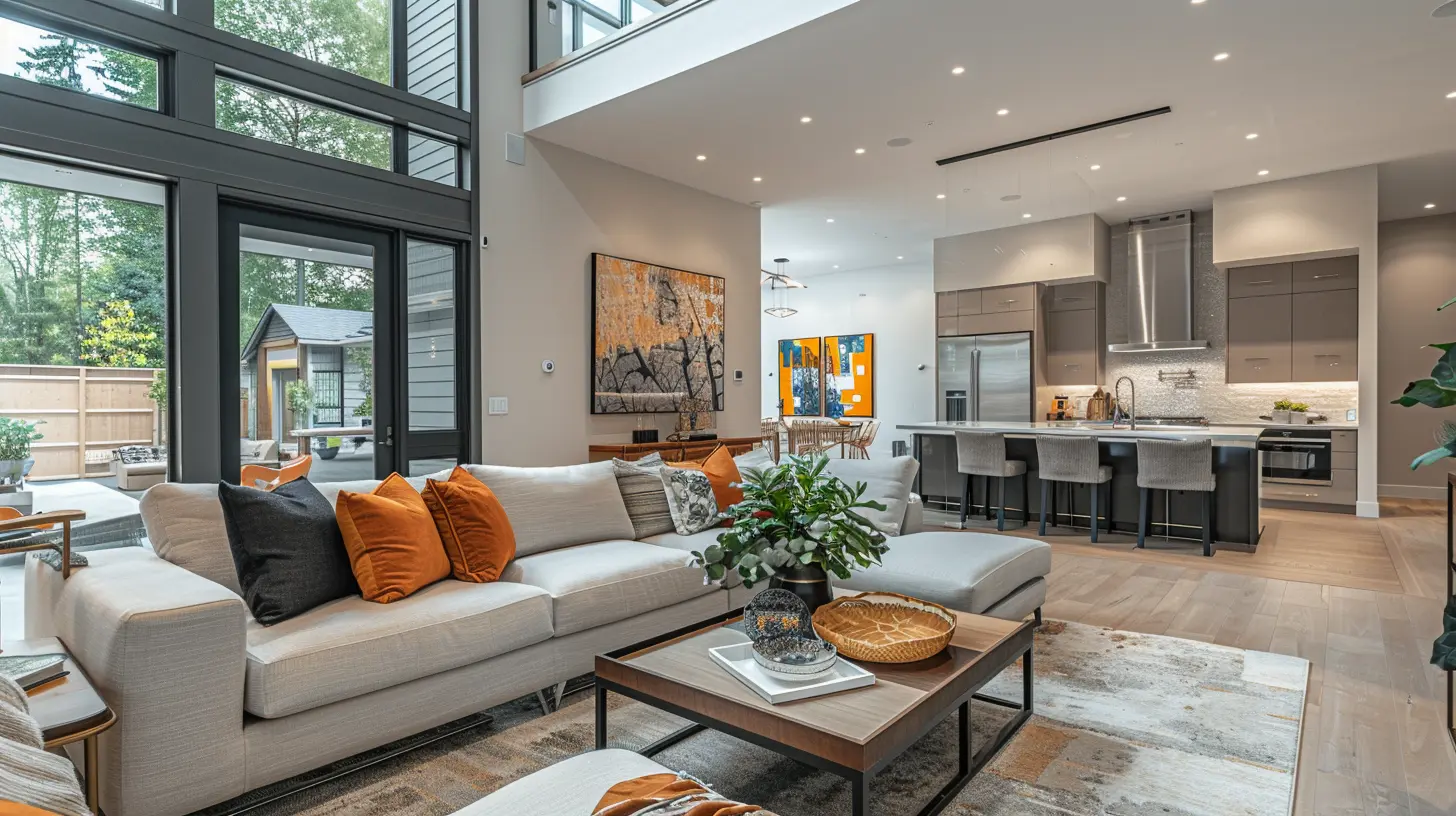
Getting Started: Assess Your Neutral Foundation
Take a good look at your space. What are you working with? Are the walls white, cream, or a soft gray? Is your furniture mostly taupe or oatmeal? Identifying the undertones of your neutral palette is key. For instance, warm neutrals (like beige and tan) pair beautifully with rich, earthy tones, while cool neutrals (like gray and white) look stunning with jewel tones like emerald green or sapphire blue.Here’s a quick tip: snap a photo of your room on your phone. Sometimes seeing the space through a different lens helps you spot where bold colors could shine. 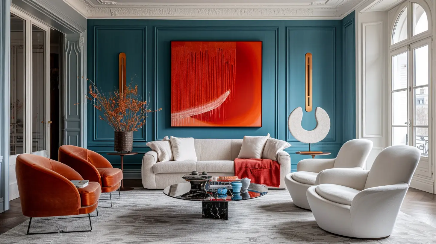
Start Small: Accent Pieces Pack a Punch
If you’re nervous about incorporating bold colors, don’t jump straight to painting an entire wall neon orange. Start small! Incorporate accents like throw pillows, vases, or even a colorful area rug. These are easy to swap out if you change your mind later.For example, imagine a neutral living room with a cream sofa and natural wood coffee table. Now, toss on some deep teal pillows or add a crimson throw blanket. Boom! Instant visual interest. Suddenly, your room feels curated rather than cookie-cutter.
Think of these small bold accents as seasoning in a dish—just a sprinkle can transform the flavor entirely.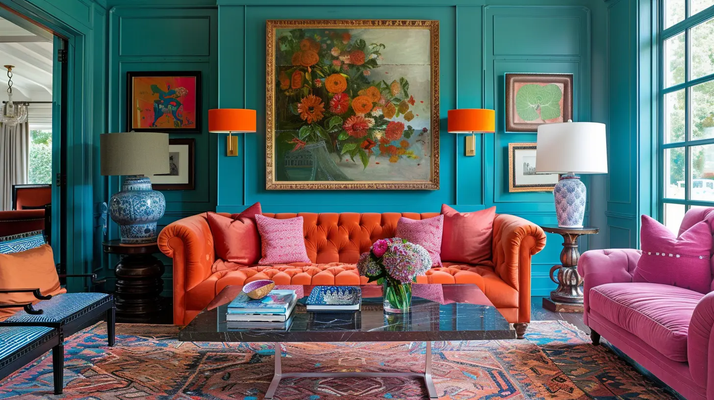
Be Strategic with Your Statement Pieces
If you’re ready to take things up a notch, consider adding one or two statement pieces in bold colors. A bright yellow armchair, for instance, can serve as a stunning focal point in a gray-and-white room. Or maybe a piece of abstract art in vibrant reds and oranges becomes the centerpiece of your otherwise neutral dining room wall.Statement pieces are like that one friend who’s super charismatic but doesn’t steal the show. They’re fun and bold, but they let the neutrals around them keep everything grounded and harmonious.
Paint with Purpose: Accent Walls and Doors
Feeling daring? Paint is your best friend. An accent wall in a bold hue can completely transform a neutral space. Imagine a dusty pink feature wall in an otherwise white bedroom—it adds warmth and character without being too overpowering.But don’t stop at walls! Painting interior doors in bold colors is a trend picking up steam. Picture a soft gray hallway with a navy-blue door standing proud. It’s unexpected, and it gives the space personality without being too “loud.”
Not ready to commit to paint? Peel-and-stick wallpaper is an equally fantastic option. These are temporary and come in all sorts of bold patterns and colors. Plus, they’re renter-friendly!
Layering Textures and Fabrics
Bold colors pop even more when paired with exciting textures and fabrics. Picture a neutral couch with velvet emerald-green throw pillows or a chunky knit mustard-yellow blanket draped over the armrest. The interplay of hard and soft, matte and shiny, creates depth and keeps your space from feeling too “flat.”Textures are like backup singers—they might not be in the spotlight, but they elevate the entire performance. Bonus points if you mix patterns, too! A striped rug paired with floral curtains sounds wild, but when grounded in a neutral space, it just works.
Lighting Makes a Difference
Do not underestimate the power of good lighting. Bold colors need the right lighting to really shine. Think about it—what’s the point of putting up a stunning mustard-colored painting if it’s sitting in the shadows?Natural light is always a winner, but if you’re working with a darker room, invest in some lighting fixtures. Table lamps, floor lamps, or even LED strips can highlight bold statement pieces and make them stand out.
Also, consider warm vs. cool lighting. Warm lighting can soften bold reds and oranges, while cool lighting makes blues and greens feel crisp and fresh.
Mix and Match: The 60-30-10 Rule
If you’re worried about going overboard with color (we’ve all seen those chaotic spaces that feel like a crayon box exploded), stick to the 60-30-10 rule. This classic design principle works like magic:- 60% Neutral Foundation: Let the majority of your room stay neutral—think walls, large furniture, or rugs.
- 30% Complementary Colors: Add a secondary color that enhances the space. This could be your curtains, a side chair, or an ottoman.
- 10% Accent Colors: Bring in bold pops of color through small decor items like picture frames, candles, or plants.
This formula works every time and keeps your space looking balanced, not chaotic.
Don’t Forget About Nature
Bold colors don’t always have to come in the form of paint or furniture. Plants and flowers are a fantastic way to add vibrant hues to your space. A leafy monstera plant in its lush green glory or a vase of fresh sunflowers on the kitchen counter can work wonders.Plus, plants bring life to your space, both figuratively and literally. They’re like an instant mood boost, and who doesn’t need more of that?
Trust Your Gut
At the end of the day, your space should reflect YOU. Sure, there are design rules and trends, but if that hot-pink throw pillow makes you smile every time you walk into the room—go for it. Trust your instincts and choose bold colors that resonate with your personality.Remember, it’s just decor—nothing is permanent. If something doesn’t work, you can always tweak it. Think of your home as a living, evolving space that changes as you do.


Zevon Clayton
Love the vibrant ideas! Bold colors inspire!
April 4, 2025 at 3:14 AM